Daily news, dev blogs, and stories from Game Developer straight to your inbox
Sponsored By
Featured Blog | This community-written post highlights the best of what the game industry has to offer. Read more like it on the Game Developer Blogs.
Pseudo 3D is a bit of a lost art. How do you go about placing assets in a pseudo 3D world in the modern era? This is what we bashed our heads against.
26 Min Read

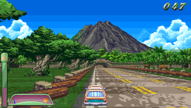
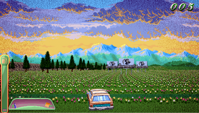
We made a pseudo 3D game in 2015. It's called Oh, Deer! Alpha, and we didn't fake it. There are no polygonal roads with filters over them, no cheats, just six sprite atlases and a bunch of code. The bulk of the work was done by my colleague Decinoge, as lead artist and solo coder. While I can't personally tell you the details of the codebase, I'd like to share the unique challenges involved with placing assets in a pseudo 3D world. Each asset you see in the game was placed by hand, either individually or as part of a pattern, just like the good old days.
Through several weeks of painstaking adjusting, nudging, and coaxing, we got look and feel of the game you see below. In this article, I'll outline some of the things I learned about populating a pseudo 3D world, and how I had to learn to think a bit like the Old Gods of Videogames in order to make it happen.
Why do this at all!?
I love pseudo 3D. It represents a time of experimentation, where hardware wasn't powerful enough yet to do polygons, quads, or even voxels efficiently, but RAM was getting cheaper. This meant that when it came to simulating 3D, the solution was just to throw more sprites at the problem.
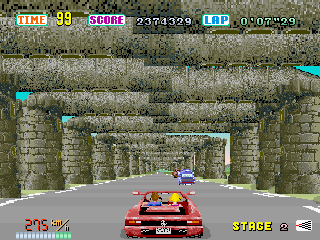
In order to fake 3D, a number of companies, including Sega with its Outrun, Afterburner, Space Harrier, Power Drift, and Galaxy Force series, realized that scaling a bunch of sprites at a player character looked a whole lot like moving through a 3D world. And there's something about this technique that feels a bit “more” 3D to me than actual 3D, simply because it's so exaggerated.
When polygons came along, nearly everyone got right to work on making things look "real." Pseudo 3D was never going to look realistic. In order to look good, it was exaggerated, pushed to the limit, almost to the point of the ridiculous. See GI Joe, or the aforementioned Galaxy Force II. It's just ridiculous that all this is happening with just sprites, perspective, scaling, and a lot of RAM.
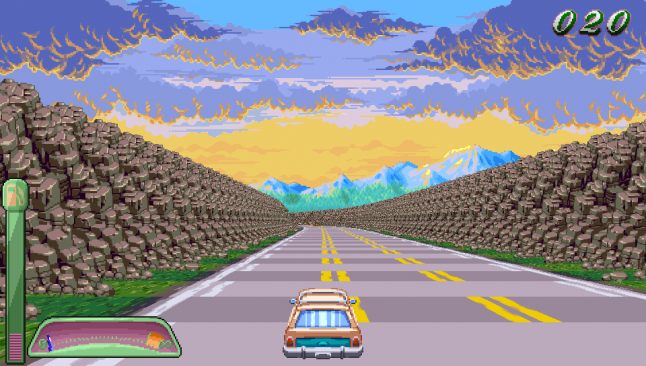
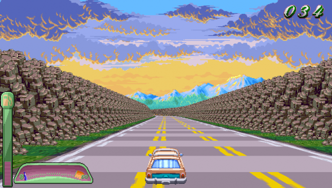
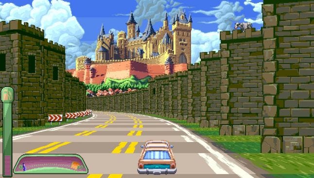
That's the feeling we wanted to invoke with our game Oh, Deer! Alpha, an alpha build of our pseudo 3D racing game for PlayStation Mobile. If the video of our game above was a bit quick for you, you can also check out a nice video review from BlueMaxima. If it was too slow for you, watch this vine!
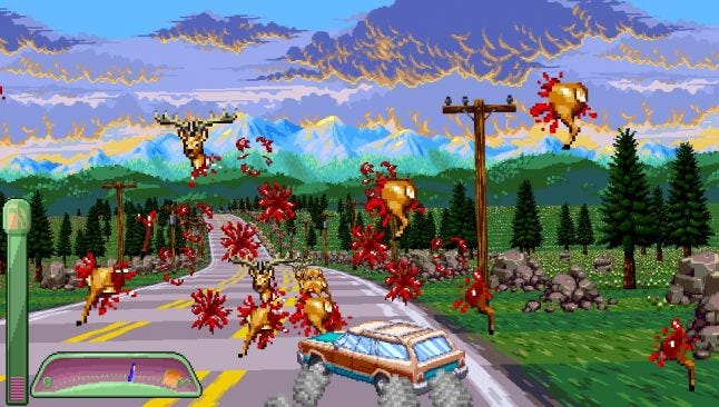
Oh, Deer! Alpha
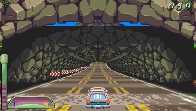
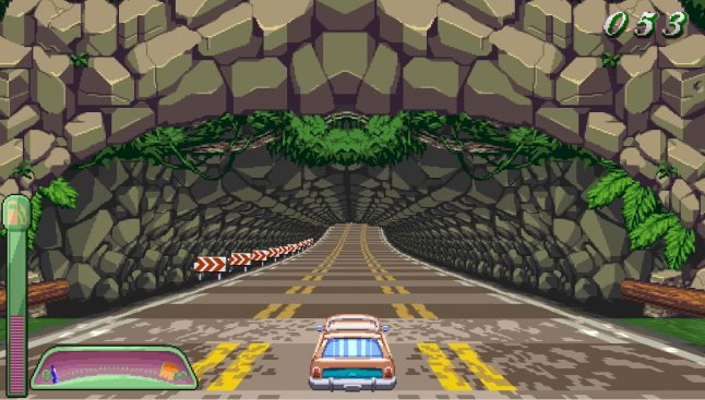
You may notice that, compared to the original Outrun, say, we have a lot more sprites on screen, which fit together rather well. Take the original tunnels in Outrun for example. To make these, the team took castle parapets and added a horizontal block to the top. It basically works, but those two pieces weren't designed to go together. All our pieces were designed to fit perfectly – but of course, it didn't always work out as smoothly as all that.
These pieces work okay in motion, but don't really go together.
Tools
The earlier games that did this had to code in their assets. Because of limited ram and limited time, they wound up repeating a lot, and some areas look rather sparse and under-populated. Lush-looking games like Galaxy Force II or GI Joe must have taken an intense strength of will to code.
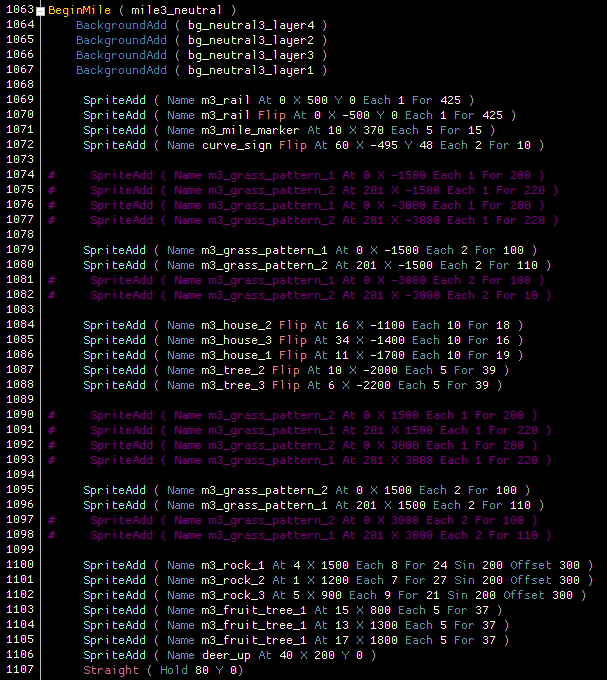
Luckily for me, Decinoge knows I'm not a coder by any stretch, so he made me a script tool. It was still tough to get my head around, since it was very numbers-oriented, but it's a lot better than the alternative!
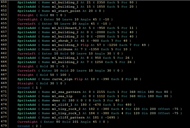
The Oh, Deer! scripter.
In the image above, you can basically see what we were doing. I'll just be giving some cursory examples here, since this scripter is obviously specific to our game – but the practices we used here may be of help if you try to do a pseudo 3D game of your own.
To create the track, I'd write in curves and straights, at what angles the car would enter, hold, and exit the curve, and how long each of these pieces would take to complete. A unit is a “segment.” Think of the alternating light and dark lines on the road in Outrun – one of those is a segment. Our entire game is defined by how many segments there are, and what happens along those segments, so a curve might be 90 segments long, with an entry and exit of 30, and a hold of 30, for a nice even ride.
To place deer on the road, or assets on the side of the road, I'd do a SpriteAdd, then define for how many segments that sprite would remain, and at what interval (for example, every 5 segments, for 10 segments, which means 50 total instances of that object in a row).
If there's an animation, that needs to be defined earlier as a Pattern (you'll see m1_sea_pattern in the image above, which is our lovely lapping wave pattern), and then can be placed like a regular asset. We had to do this for things like waterfalls, sandfalls, jumping deer, et cetera. But for moving clouds, I could just define a sin wave and rate of movement, and the game would do the work for me.
I can give all these assets an X and Y position, placing them further from the road, or on it, or over it, or under it (as we had to do with our rope bridge segment). Mess this up, and your lovely lapping wave pattern turns into a flood warning.
The last important piece of info is the “flip.” Some objects are meant to face right, and others are meant to face left. I can flip them to make them look proper on the opposing side of the track.
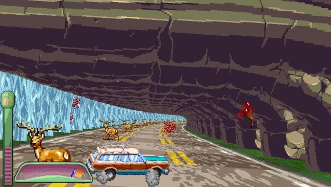
This is very important, because - to kind of bring it all together - tunnels are nothing more than three sections of a sprite, mirrored and flipped to meet over the middle of the track, then repeated for a number of segments.
Here's what happens if the tunnels don't meet up properly.
A separated tunnel.
Lessons learned
There are probably lots of tricks that the masters have down pat, but I'm not aware of any repository of this knowledge. I basically learned new best practices, tricks, and workarounds as I placed assets, mile by mile. And here are a bunch of them!
- Fitting pieces together. This was tricky stuff - we had assets made of several pieces at times, and fitting them together was laborious. Generally I started with them way too far apart, then changed the X or Y position incrementally in order to get them into the exact right spots. While I knew the width and height of these assets, that wasn't really helpful in terms of positioning. Ideally, if you make a game like this, it would be useful to mark these positions for the person putting the art in (in this case me), when splitting the sprite apart in the first place. I spent several hours positioning these assets that could've been spent on other tasks.
- Segments are the same width everywhere. This sounds obvious, but think about curves in 3D racing games (or, you know, reality). The inside of a curve is basically the best and fastest route, right? Not so in pseudo 3D. It doesn't matter whether you're on the inside or the outside, the distance is always the same. Once I got this in my mind, this meant I could place deer on the inside or outside without worrying too much about diminishing speed, which came in handy. I knew I wanted players to be able to hit all deer, or avoid all of them, which meant leaving enough space for both of these actions. It would've been tough if the inside was always fastest, since the "no deer" path is inherently slower. This is because on a "no deer" path, the player can't hit the speed up deer, which substantially increase your speed without reducing your gas at a faster rate. So having the segments be the same width everywhere was a boon.
- Tunnel trouble. There were a lot of issues with caves and hills. Here's one we could have avoided. Essentially, the "inside" assets for our tunnels in mile 3 had no real "top" to them. They were meant to fade up to grey, and don't look like the top of a tunnel or anything. This means you could basically never look at them from above, without them looking like garbage so you couldn't come up to them from a hill, and couldn't put them on a hill, either. We actually had to increase the height of these assets to reduce gaps in between where you could see the background (another tunnel trick). That's part of why Mile 3 is so flat (the other reason is I wanted it to be a total drift-fest). I actually made the tunnel sections go downhill just a bit to make 100% certain you couldn't see the tops, because of the additional height we'd given them. In the future, we might pay more attention to the "top" of the tunnel_inside asset in order to make it read visually as the top of a tunnel from above, and the inside from below.
 See that greenish-grey mass above the tunnel on the right? Not so attractive.
- Tiny assets. We had about 7 artists on this game. With that many people working on a game across several months, not necessarily talking to each other, where no two of them are even in the same country, you're bound to get a few anomalies. And so it was that one artist made all of her assets the correct size relative to the car - whereas nobody else did. Theirs were much bigger. See this Vine, and note how large the ferns are compared to the huts that people are meant to live in.
This problem presented and resolved itself in a few ways. In the case of the vine above, I simply placed more of the the larger assets further away from the road, to make the smaller ones appear bigger. Our good old friend perspective comes in with the assist! Obviously, in the future we'll take greater care to ensure all assets have the correct relative size.
- Making nature look natural. When I started placing assets, I put trees in straight lines, since that was easiest, though I did stagger them along segment distances to create some sort of illusion of a forest. Decinoge pointed out that trees don't grow in perfect straight lines, not even when planted by humans. He suggested using aggressive sine waves to create the illusion of randomness, and it worked very well. I wound up using this trick throughout the game to make assets appear to be more organic in their placement. I'd use multiple sine waves of different intensities for the same asset, each of row of which would be placed a few hundred pixels apart, and they'd appear to be one stretch of natural objects - a grove of trees, or a rockfall.
I used this sine wave idea by our cliffs, too. The cliffs looked too antiseptic by themselves, really straight up and down. Using sine waves on the actual cliffs looked ridiculous, because the assets weren't really made with that in mind. But I had a bunch of tiny rocks in my asset list, and previously there'd been nowhere to put them. When paired with the cliffs and a narrow sine wave, they looked like debris that had fallen off the cliffside. Suddenly it looked a whole lot more natural.
 Cliffs, with rocks (above), and without (below). Without the rocks, this just looks like a weird corridor. With the rocks, they look like cliffs again.
- Sprite saving. PlayStation Mobile, as nice as it was in terms of democratizing game publishing, didn't give you the full power of the Vita. Because of this we ran into performance issues quite frequently. The biggest battle was between the number of sprites I wanted to put on screen and the framerate. Just like the good old days! While the framerate still isn't amazing all the time (especially during mile transitions), it was pretty dismal in the days leading up to release. We had to solve this by removing assets in a variety of ways.
From the start, I placed assets wherever I wanted, as many as I wanted, to make the game look good. Then, once I deployed these tracks to the device, I'd play and look for problem areas. When I identified those on the console, I'd remove assets that I thought people might not notice. Check out this segment of Mile 3 in the scripter. I'd intended to extend the grass out as far as the eye could see. It looked real nice! But would people notice it when going fast? Probably not. So I commented out the further stuff, and frankly it looks fine. Cuts like that were easy enough, and mostly led to a narrower field, or a bit less detail here and there.
We commented out the sprites we felt people wouldn't miss too much.
Sometimes, though, removing assets just looked like crap. In Mile 2, there's a waterfall overhang. That overhang is composed of three sprites stitched together, repeated every segment. That turns out to be a lot of sprites all by itself, and the more sprites you have close together, the more you notice framerate problems. I tried placing the entire overhang every other sprite, or even just the waterfall part, but every attempt I made looked gross. But there was one thing I hadn't taken into account - I'd had a railing there, to keep people from driving through the water and into the empty blankness on the other side.
The waterfall overhang. There was a rail here. It's gone now.
The thing is, I'd forgotten one more feature of the scripter - I can make any asset have solid collision or no collision. Since the water was its own segment, I could make it solid and use that as a barrier, removing the railing. The framerate isn't perfect in this section, but it's massively better without totally breaking the way the game was meant to look.
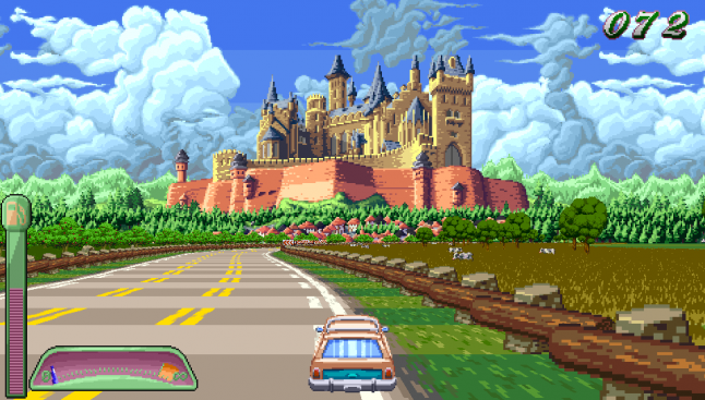
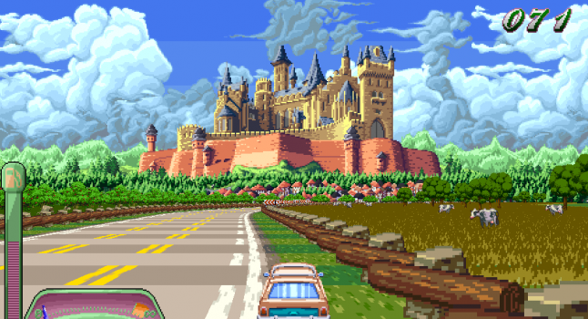
- Perspective pranks. One fun thing about pseudo 3D is you can sometimes hide things in plain sight. I put easter eggs in each mile, most of which are related to driving off the road. But one of my favorites is just a simple trick of perspective. If you're driving where you're supposed to, you'll never see this furry sentry on top of the castle walls. But if you slow down and move to the right side of the road in just the right spot, there she is, lowing into the night (well, afternooon I guess).
Secret cow!!! (Top right)
Hacky tricks
Sometimes I just wanted to get it done, and we didn't have the art (or time) bandwidth to fix certain things. Here are a few last-minute fixes that saved the day.
- The cave coverup. As it turns out, a segment is a tough unit of measurement. Sometimes there's a gap where you want things to appear solid. As I mentioned, those caves are a split up assets repeated over and over. Well, what if that asset is on a hill, going down? Then the top of the subsequent asset is lower than the preceding one. This means you might be able to see "through" the top of the cave in certain spots. Likewise, sometimes the inside of the cave starting 1 segment behind the front of the cave leaves a gap. Such was the case with the cave in Mile 2 of Oh, Deer! Alpha.
A cave gap.
This problem only shows up for a split second, but I didn't like it, and wanted to find a solution. It turns out I had a bunch of spare leaf assets in the atlas. They were originally meant to be interspersed with the trees, but they just didn't really work out in that context. Instead, I put three of them on the same layer as the cave front, but lowered a bit, obscuring the gap between the first segment and the next. The illusion work pretty well, and the cave looks much better, besides!
All covered up!
- Visual warps. This is a problem introduced by some of my more aggressive hills. Sometimes, when you go down a hill, if there's another steep hill after it, the entire background appears to stretch toward you. It's impossible to represent with a screenshot, you have to see it in motion. But if you play the game, you'll still see it a lot in Mile 5. There I like it, because it adds to the sense of speed, and the warps are very small. But in Mile 4, the hills I had made were really warping the environment pretty fiercely. It didn't look so bad when it was a bare road, but once you put assets on there, it looked like they were rocketing toward you.
Now, the real solution would've been to redo this mile and make it a bit more manageable. But we had two weeks to finish this game, and I just couldn't bring myself to mess with it - not least because the timings for each mile were basically set. So I did the second-best (maybe third-best) thing. I hid them.
These arches cover the section of track, back-right, which is going to warp strangely in a few segments.
We have these lovely sand arches in this mile. They're different from tunnels in that they're meant to have gaps between them, not be solid and contiguous. Astute players might notice that they tend to show up quite a lot right before you're about to go down a steep hill. This is because their blocky sides cover up the visual warp that's happening. If you slow down, you'll see a bit of it it, but if you're going a proper speed, you'll never notice it happened, because it happened behind the walls of these arches. Tricksy!
- Whatever floats your cow. Back to that "small assets" issue I mentioned before. We solved some of it with perspective, but we had a much larger problem in Mile 3, with our cows. I wanted wheat fields in this section, because the ground looked too bare by itself. I also wanted cows! But these dang cows were too short! Look at them. They look okay when the car is static, but when you're moving, they just register as tiny white blips in the background.
Cows in a sea of wheat.
So I had a dilemma. Do I scrap the cows? Do I go with a less interesting floor, just to have visible cows? This part of the level looked really sparse when I tried both options. There had to be a better way! And lo and behold, my creaky old brain found the solution. Levitation.
These cows were standing on the ground, like most of our assets. But I have control of the Y axis as well. What if they "stood" just a few pixels below the height of the wheat fields? They looked a whole lot better. I was worried they'd look like they had extra long legs, but our brains tend to fill in the information they think should be there, and frankly these cows look fine! They're 29 pixels off the ground, but they look much more natural and visible than they do when they're actually grounded. So don't be afraid to play around with your assets!
These cows look alright!
- Hide empty space. Empty space in pseudo 3D looks weird to me. The original Outrun looks pretty barren by today's standards. But empty space with an asset that ends sharply or abruptly looks even weirder. In Mile 2, for example, we have a cave pattern that extends the "walls" of the cave out to the edges of the screen - in theory. It can't actually get there, because the pattern isn't that long, and the screen is real wide, especially when you factor in the extra field of view you get from turns. So these walls had to end somewhere. But they looked so unnatural in the way they ended. So I put a tree there to hide it.
You'll see this a lot in the game, if you look out for it. I use trees, pillars, whatever I've got on hand, to hide the sharp edges of cliffs, tunnels, you name it. Pseudo 3D is all trickery, and I love it.
The cave's edge without trees (top). The cave's edge with a tree obscuring it (middle). That same area in the final game, seen through the foliage (bottom). Not so noticeable!
Philosophy
As the game's coder will tell you, I did not go into designing the levels, or placing the art, with any particular kind of philosophy from the start. I had some vague notions - for example, the game would be a morning to night cycle, with each segment taking place during a later time of day. You start out in the morning, you get to grandma's house at night. I also knew that each mile would take place in a different, sometimes exotic locale.
Beyond that, I didn't really have a unifying theory of design or asset placement. Over the course of three weeks of insane brain busting, I managed to sort of push a few ideas together. Here's what I wound up with.
- Give ideas time to breathe. Really, the game is quite straightforward. Go fast, turn left, turn right, drift, hit deer, or don't. That's about it. But there are visual themes and archetypes that are introduced as well, and special deer, and different ways to crash, and if you just shoved them in all at once, they might wind up being more noise than signal.
So I wound up introducing things slowly. The hitting of deer was saved until you got out of the city, which also makes sense thematically. By then, hopefully, you'd learned to steer and have now been forced to drift. The deer would come as an amusing surprise, then. This has tended to work, as people usually laugh the first time they see a line of deer exploding in a shower of ridiculous pixel blood. After that, speed deer are introduced, and the ability to crash full-on. The drifting in Mile 1 is relatively lenient. You can make it through without being too proficient.
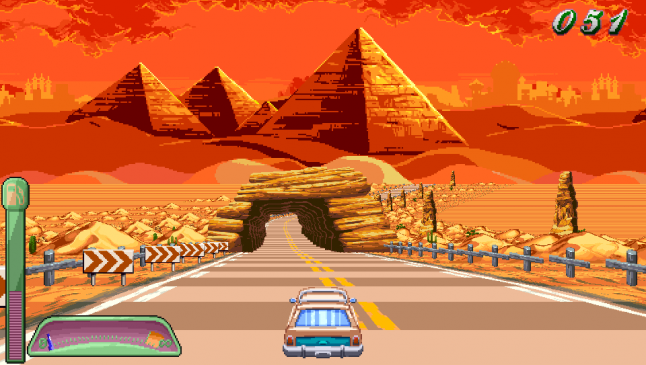
Mile 2 introduced long drifts. You've got to maintain good speed in between them, or else you'll wind up slowly eking your way through the tunnels. Speaking of speed, this is also where I introduce slowdown deer - but I put a speed up deer nearby to not make it too punitive. Mile 3 is all about continuous drifts - here, you really have to economize your straightaways and longer curves. Mile 4 is all about aggressive hills, being a desert level full of sand dunes. Mile 5 throws it all together - tight drifting, weird hills, crash opportunities, speed up, slow down, and also deer in a sine wave pattern to boot.
The tracks aren't perfect, but I do think they at least have a logical gameplay and visual progression.
- Planning for time. In Oh, Deer! Alpha, you have a fuel gauge which ticks down as you play. This is essentially a timer, counting down to a game over. Each stage you complete gives you a few more seconds of fuel - you start with 80 seconds, then on stage 2 you're given 70, then 60, then 50, then 40, adding up to a total of 5 minutes. That's how long we wanted a full playthrough to last, so I tried to tune each mile to be exactly 60 seconds long. But what is 60 seconds, when your game is made up of a rather obtuse measuring system known as "segments?"
What I did was this: I'd make a mile of track that I was comfortable with, then play it. I was aiming for a perfect playthrough to take around 53-55 seconds, and for a playthrough with one or two minor screwups to take around 59 seconds. So I'd play the game and remove segments, or add them, in order to get to the numbers I wanted. Of course, this was rather messed up by the addition of the speed up deer, which make you go much faster, but it was the best I could do with the time allotted. In the future, we'll just spend a lot more time on these tracks.
- When in doubt, write it out. When I was making stretches of road, I could play around, place random curves, see how they felt, and react to that. It was a pretty fun process that lent itself to experimentation. When it came time to place art assets, though, it was a different story. In order to make any small section of the game look good, I'd probably have to place at least five or six different (or repeated) assets per segment on either side of the road, and each of those had to be positioned along the X and Y axes in ways that looked good. Each "chunk" of assets like this could maybe be repeated for 1/10 of the track at max, without boring you. This was too much to experiment with. I couldn't really just fire away and see what stuck. There was nothing more daunting to me than an empty track.
Mile 1 wasn't too bad, since I had a progression of assets. City, rocky, country, leading into Mile 2, the forest. It made sense. Mile 2 had several big set pieces - waterfalls and bridges - so I could build around them. When I got to Mile 3, I just didn't know what to do. I had a mess of assets, any of which could go anywhere. How to choose? And how would I keep track of all the assets I could potentially use?
This is where I came upon the idea of drawing the track I'd made from above, annotating it in terms of the lengths of turns and topography, and then placing ideas for assets next to each little segment while looking at the list of assets I had for that mile. This worked pretty well. It's probably hard to tell, but in the image below, that's just what I did.
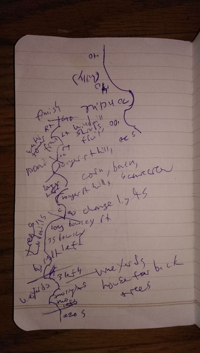
A sketch of Mile 5's road.
I never intended for this to be read by anyone else, so it's some real chicken scratch, but you can see I described the turns (long bouncy right), and then wrote in assets that might be appropriate in that area (trees, windmills) on the right and left, since symmetry makes things pretty boring. I didn't follow this guide perfectly, but it gave me a place to start from, and let me know I had all my assets accounted for.
- Reward game-busters. Hiding easter eggs was super fun for me. I have a tendency to break games once I've gotten all the regular enjoyment from them that I can. In some cases this happens very quickly. In the case of Oh, Deer! Alpha, a very well-played game lasts just under 4 minutes. While you can repeat the game for score, and I hope people do, I could imagine people getting tired of it and wanting to poke around at the game, and see what pokes back.
There are several places where you can drive off the road in Oh, Deer! Alpha, and if you get all the way off, you're not getting back on. But I figured some people might try, and I placed weird objects for them to find when they did so. A triforce of Necrosoft Games billboards. A spasmatically moving hut. Intersecting gas signs. A shrine to the fallen deer. These are all in there somewhere, hanging out in the periphery. You'll never see them if you don't break the game, but I want to reward those adventurous souls who try. These are very small easter eggs, because of the time we had, but I wanted to make sure that if people tried something daring, they'd get at least a small reward.
You'll never see this if you don't drive off the road. It's small, but it's there!
The art of faking it
Pseudo 3D really is about faking it. There's no 3D in this game, just a bunch of flat objects scaling toward a car that's smack in the middle of the screen and rotating around. Trickery and fakery in games is lovely. If we simulated real physics and drifting mechanics and worlds, this would not be the game that it is. It wouldn't be the game we wanted it to be. So in order to make the world fit the code, I had to learn to fake it all over again.
If you're interested in this game, you can still get it on PlayStation Mobile for one more week - it's gone forever on July 15th, so act fast! And if you want to join in on the discussion, we'd love it if you took a look at our Discord channel. Thanks for reading, and here's to all the magicians out there!!
[Update 2017: the game is no longer available via PSM, but you can play it if you have Humble Monthly!?]
[Update 2021: Since folks keep asking us, the game is no longer available anywhere! We considered PlayStation Mobile and Humble both as early access, and time-limited. We will hopefully finish this game eventually, and we really appreciate all the emails and discord messages we get asking for updates! We don't have news for you yet, but we hope to in the near future. Incidentally, check out the Beta trailer if you want to see a little of how the game evolved since this article was written.]
Read more about:
Featured BlogsAbout the Author(s)
You May Also Like