Daily news, dev blogs, and stories from Game Developer straight to your inbox
Sponsored By
Featured Blog | This community-written post highlights the best of what the game industry has to offer. Read more like it on the Game Developer Blogs.
I've been thinking about launch trailers for years. Maybe some of these thoughts could help map-out your launch trailer's plans.
7 Min Read

Launch trailers are the easier kind of game trailer — you already know what your game is, who your audience is, and what players expect of the game. All you need to do is reinforce confidence to hit that “buy” button.
Still, there’s more to it.
Your launch trailer will champion your game for years to come. So it needs to achieve “shut up and take my money” status instead of, “…I’ll wait for the bundle.”
The split comes down to FOMO.
“You’re missing out!”
We buy games because we don’t want to miss a one-of-a-kind experience — the kind that makes us wonder what’s even possible. With every trailer I make, my gut is to draw people into “here’s what you’ve been missing out on.” It’s even better when the game already has already blown up.
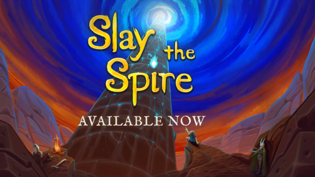
Our Slay The Spire launch trailer starts in the thick of things. You don’t know who you are, why you’re here, or how card combat works. You’re on the ropes. Right where I want you.
I wanted folks to feel what they had been missing out on. This is best felt when we show streamers rocking the game at the highest difficulty. In this collage, you feel a sense of phenomenon — something that caught many of us by surprise. That surprise sensation is a luxury few launch trailers can afford, but it merely helped work-up to our best card: that emotive sense that you’ve been missing out.
Even if you know nothing of roguelike card games, and even if my gameplay footage is hard to contextualize, people leave the trailer with an unspoken sense of, “There’s more to this than the trailer could do justice.” That is not an accident. It’s a precision confidence strike that annihilates any chance for buyer’s remorse — or at least hits it 0.3% modifier. Not bad odds.
“There’s way more inside!”
I’m taken back to Star Wars’ Cantina: more world building gets done in that tiny little bar scene than anywhere else in Star Wars. The trick is the cutaway shots you don’t remember: the alien rejects flashed in two second shots inform the expanse of the galaxy at trailer-light speed. You can’t even remember how many you saw, just that there was a lot of them.
This is our move.
You want to stick within the comforts of established narrative, but cram as many flashes of related material into the margins, that nobody even realizes that you’ve shown them half your game. This just leaves an impression in the back of a viewer’s mind that there’s a whole world here.
If you have the perk of an on-board narrator, you can crack wise while you do it.
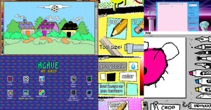
With Parkitect, it felt like I could never fit all of its toys inside a single toy box. So I made a script about how it was “300x bigger than any theme park ever.” While it’s just a roll-over joke, the real meat-qualifier is the seven shots before that reveal theme parks inside of the real theme park. Typically, I prefer subtlety over braining viewers with “see more inside.” But I’m glad it works here as a heavy handed illustration. Haha.
Once you find a way to show there’s more meat than potatoes, it’s time to start making people feel comfy on the rug you’re about to pull out from under them.
“This feels comfortable…”
We first want to make players understand something about the game. Usually that requires we establish the genre and bring people up to speed brick by brick. But as with the Slay the Spire example, it was first important to make people feel like they’re missing out. So you can decide where to set the foundation to build on: whether that’s the very beginning, or a bit later.
In The Messenger’s launch trailer, I sought to first orient the player with the game’s most-unique mechanic—namely the air-strike-to-extra-jump “cloud stepping.” You see the technique used early, but then it’s used in advanced fashion all the way up to the end action shot. This technique is standard game design: teach, test, escalate, then test harder. This is basic gameplay trailer literacy in action.
Next, it’s time to complicate matters. Suddenly we reveal this isn’t just an 8-bit platformer, but transitions to 16-bit scenes on the fly. This portal transition can disorient if we didn’t first set the context. But because the player know what kind of game it seems to be, it’s the right time in the trailer to say, “oh but there’s more!” Once you frame things, you’re free to stack on top, and build-up further complications.
If you do this just right, you make the viewer happily disoriented.
“...This also feels really different!”
Once you’ve grounded your sense of orientation in reality, you have enough footing to swallow the weird pills. That’s best illustrated in how we did YIIK’s launch trailer.
YIIK starts with an odd feeling in a familiar town. Then it goes so far off the rails that you forget there were ever rails.
The key was for me to pour over the script looking for every human, relatable moment, and try to draw an underlying nest out of those very natural interactions. That way, when we get to talking pandas, mind dungeons, and JRPG battles with violent trash cans, we already made you feel connected to real things like Y2K panic, skateboards, and 56k dial-up modems.
Imagine if we didn’t first start with that Y2K footing. All of the surprise of getting hit by a giant asteroid at times square on New Years in the year 2000 would have zero weight. It would leave people with an unspoken “meh” instead of an audible, “WTF?!?”
Think hard about that last shot. The last emotion you land on: that's the lasting connection folks have with your game. You want them to leave with some big feelings.
“This is my stuff!”
Your farewells should wave the freakiest freak flag that you’ve got. This rally call reminds your unique tribe of who they want to be. So don’t be ashamed of any bit of your game’s greatest eccentricities. It’s best if you just end by showing things jamming on their maximized cylinders!
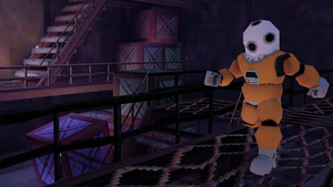
I didn’t plan on landing here, but I want to draw an emphasis on how we ended with Risk of Rain’s Nintendo Switch trailer. It’s almost unreadable. Which is sorta the point.
Paul Morse recorded this gameplay footage for me, so I had to interpret his actions. I can definitively tell you that that the big circle is getting bigger, and things are getting more intense. Past that, it’s just almost too much for me to process.
We leaned into the chaos instead of opting for a cleaner UI.
Typically you want to turn off all the UI of a game. But in our Switch build, there weren’t any reasonable ways to do this. So we leaned into the on-screen clutter the same way the game itself does. If you don’t like seeing crazy numbers pop out of gargantuan beasts, this probably isn’t the game for you anyway. That’s okay. Those who see this and like big numbers flying out of beast butts, know this is totally their jam. These players were the ones who already shared their first run of the game before I got my copy — an hour after it came out.
Serious fans know what they want. So leave them feeling like they seriously matter — by showing them their favorite selves in-game.
Read more about:
Featured BlogsAbout the Author(s)
You May Also Like