Daily news, dev blogs, and stories from Game Developer straight to your inbox
Sponsored By
A two-part look at some of the fundamentals of drawing 2D game environments. In part one we examine a screenshot from Metroid Fusion that does almost everything right, and then check out some other sexy sidescroller graphics.
10 Min Read

DISCLAIMER: This article will not teach you how to magically draw wonderful backgrounds! This is a pragmatic look at some basic organizational techniques and principles that can help your 2D game world make more sense to your players. If you are interested in the fine art side of things (shading, form, etc), you can check out this thread on Pixelation. It's got lots of helpful links to tutorials and all sorts of cool stuff.

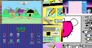
IMAGE: hiding from the SA-X was so rad!
Metroid Fusion is a bit of an oddball game. It was released almost 7 years ago, back in November of 2002, at almost the same time as Metroid Prime. The last time Nintendo released any Metroid game was April of 1994, when Super Metroid hit the Super Nintendo and became a bit of a sidescroller legend. Fusion was put together by the Super Metroid team (tragically sans Gunpei Yokoi) and received near universal acclaim, though its short length and narrated, linear story are a source of disappointment for many.
For me personally that was a pretty great November. I'm a huge Super Metroid fan (like everybody else on earth except Arne) and the two Metroids that hit that year are my favorites after the seminal Super Nintendo classic. The linear nature of Fusion irks me, definitely, but it brings so much else to the table that I'm willing to forgive it: tons of great boss fights, some awesome twists on classic Metroid gameplay, atmospheric music, and really kickass tiles.
On that note, let's see what the artists at R&D1 did that makes their tiles so effective. I'm going to go through the salient points in the order that I actually use to paint my own tilesets.
The Basics

IMAGE: its like chess only IN SPACE
So if we're gonna do this let's start WAY back at the beginning! Most 2D games use tiles to portray the levels or environments that you pass through. While this was a technological necessity at first, it remains an efficient and useful way to render a 2D play space. It allows you to quickly and easily re-use art elements, and you can connect the art to physical or collision models with ease. The checkboard above is an overlay showing how the background is divided up into square tiles that are 16 pixels wide by 16 pixels tall.
(note: uber pixel artiste ptoing rightly points out that the GBA used 8x8 tiles with X and Y flipping to create 16x16 meta-tiles. For the purposes of this article it's a little less intimidating to just view them as 16x16!)
Like a lot of game design disciplines, painting great tiles is halfway between an art and a science. If you already have a good basic grip of light and shadow and color you will have a big lead on somebody who doesn't have a grasp of the fundamentals.
However, good fundamentals are not enough to ensure that what you draw will actually be a fun space to play in. This is especially true of sidescrollers, which tend to exist in a kind of imaginary, cross-sectional space. What do the insides of walls look like? What kind of perspective should the floor have? What sort of lighting makes sense?
Blocking in the Play Area

IMAGE: whoooaoaaa exciting, this level looks awesome
I painted over the screenshot with the main colors used in each area to show how the space is divided in a very basic way. This style holds true pretty much throughout Fusion's game world; bright, obvious blocks for floors and walls, and darker, receding tiles are using to indicate backgrounds. This is especially effective since it is an indoor area, but when we get to some other classic tiling examples at the bottom of the article you'll see that this basic division of light and dark is pretty consistent, even in more organic or outdoor settings. Even if we strip out the color information, look how obvious the division of space is:

IMAGE: wow now its even MOAR awesomer
The areas of the level that are solid are still pretty obvious, even though this image has essentially 3 colors.
Not Obvious Enough

IMAGE: wowza now that is what i'm talkin about
Ok, so we can tell what's what even with three shades of gray. Can we make the division of space even more obvious? What we did here is a very common tactic; just add a bright outline to the surfaces. Actually, it's not "just" that. We're also going to add darker bands of color to the background tiles to make the outlines pop out even more. Check out our basic values now!

IMAGE: whooaoaoaoaooaoaoa
Just a few shades of gray still, but it's dramatically obvious what is play space and what isn't now. The important thing to remember is that anyone can do these basic steps. This stuff does not require art training; this is the science part! The next step is another matter...
The Details

IMAGE: yay we are done now that was easy
This step is where the art training and fundamentals start to come in handy. Once you've defined the spaced, made sure everything is readable, checked your basic light and dark values, then you can go in and start adding all the little details. Even then, as a non-artist there are some simple tricks you can pick up by studying this image.
Once you've used light and dark to define the basic building blocks of the room, pick a consistent light source to guide your shading of the finer details. Notice the wide green blocks that make up the floor on the bottom of the image; do you see the matching blocks along the ceiling at the top? They don't quite match completely - they've maintained the shading along the interior section of the block so that the dark side always faces down. Notice all the seams and beveling - the left side is dark, the right side is light.
Finally, the artists over at R&D1 pull a sneaky trick on our brains. The screenshot above doesn't quite match the actual in-game screenshot from the top of the article, which I've included below for easier comparison:
IMAGE: a HA you sneaky bastards
The change is subtle, and arguably unnecessary, but is a pretty awesome little cheat. Our eyes and brain have this funny habit of interpreting certain colors a certain way; red, warm colors appear to advance, while blue, cool colors have a tendency to recede. R&D1 use a dark red outline along all thier basic walls and floors to make those edges pop out even more. It's dark enough to not be too obvious or intrusive, but red enough to still advance over the green and blue and purple backgrounds pretty effectively.
Other Kickass Tiles

IMAGE: aaaaah so good
Flashback! This game rocked so hard it hurt. These tiles show how you can break up a grid into interesting, organic shapes and maintain good foreground/background separation even in outdoor environments with bright lighting. Notice how the colliding floor and wall tiles are generally darker than the background, but how the floor surfaces especially are actually brighter than the background. Color and contrast both help establish depth and clear play boundaries even in this weird jungle environment. Note: don't feel bad if you try to emulate this and fail, because these are truly remarkable achievements!

IMAGE: haha these guys were wizardss, i tell you what
Regarded as some of the finest tilemapping on the NES, Batman did about as much as humanly possible with its 13 color background palette. Note the design similarities to Metroid Fusion, only taken to a logical extreme forced by the limited palette. The edges of the colliding surface are the lightest, and the background is darkest near those edges. Color and contrast! Note the careful attention to light and shadow and traditional artistic fundamentals, and how they are trumped by the edges of the gameplay areas in terms of visual priority.
They do a couple of other crazy things, which I definitely don't recommend for your first outing. One is they've reversed the red/blue color relationship - their foreground is cool blue, and the background is a really vibrant red. Definitely exercise care when attempting something like that! They also do some really cool stuff with shadows to make it look like the blue blocks are overlapping and built out on top of the yellow brick, which just looks rad.

IMAGE: haha ignore that HARSH DIVIDING LINE there....

IMAGE: HENK NIEBORG is the BEST
Castlevania: Harmony of Dissonance and Contra 4 are also excellent examples of functional and artistic separation and communication, indoors and out. Finally, just so I'm not crucified by my friends:

IMAGE: this game is so friggin nuts
Anyways, I realize this is all kind of high-level and basically just a collection of examples, but I've seen a lot of really good artists just skip past this organizational step and just jump into the details with disastrous results. Art is first about communicating; realistic or believable portrayal of the surfaces is a distant second. It's still important for immersion and enjoyment, but if it's not communicating the most important, basic facts about the terrain successfully it's a lost cause.
These basic color and contrast decisions go a long ways toward completing your communication achievement. Once you have it, then you can fall back on traditional art skills to help with the atmosphere and believability of your 2D environment. Good luck!
Read more about:
BlogsAbout the Author(s)
You May Also Like