
Trending
Opinion: How will Project 2025 impact game developers?
The Heritage Foundation's manifesto for the possible next administration could do great harm to many, including large portions of the game development community.
Solo developer SomeHumbleOnion walks through how Shumi Come Home's relaxed visuals were achieved, from custom shaders to depth of field effects.

Game Developer Deep Dives are an ongoing series with the goal of shedding light on specific design, art, or technical features within a video game in order to show how seemingly simple, fundamental design decisions aren’t really that simple at all.
Earlier installments cover topics such as UI and difficulty levels in Cook Serve Forever, the challenges of programming for 2D for Sweet Transit, physics-based animation in Gibbon: Beyond the Trees, and designing spatial inventories in dark fishing sim Dredge. In this edition, Noah Lone, solo developer on Shumi Come Home, shares with us how low-poly modeling combined with depth of field effects and custom shaders brought about the game's soft aesthetic.
I’m Noah Lone, aka SomeHumbleOnion, and I’m the creator of the upcoming indie game Shumi Come Home! I’m currently solo-developing everything in the game aside from the music which is done by my good friend and talented composer FailPositive. I’ve been working on this game for over a year now and it’s planned to be my first commercial release. I started teaching myself game development shortly after graduating college in the Spring of 2022. The pandemic was very fresh and I wasn’t getting a job anytime soon, so I decided to go full force into my passion of making games!
To give a bit of context, Shumi Come Home is an exploration-adventure game with a more casual approach to the gameplay. You play as a tiny mushroom, Shumi, who was taken from its home and is trying to find its way back. Set in three different environments of an overgrown forest, long after humans have left this world, you’ll be free to explore at your own pace and take on different adventures to get closer and closer to home. Since the game has no combat or game-overs, you’ll often find yourself doing some light platforming with your climbing hooks, solving puzzles scattered across the forest, or gliding on your leaf glider through the open breeze!

One of the very first aspects I worked on when starting the game’s development was the art direction. I’m always drawn to the art first in games, so naturally, this was my first step in development. I wanted to embrace that tiny-world aesthetic, so I pulled a lot of inspiration from my favorite game series, Pikmin. But I didn’t want to go for a realistic look like they did, so I decided to try a simpler, stylistic look.
The 3D-pixelated aesthetic is something I’ve always been drawn to for some reason. When I decided to go in that direction for the art, I knew I wanted to keep things low-poly and simple so there is visual clarity with the pixelation turned on while still having some nice details for those who want the pixelation off (since it’s completely optional). This direction heavily influenced the methodologies behind the art creation because everything had to be pixel-perfect now while preventing the scenery from being too noisy.
I started taking inspiration from one of my favorite indie titles called A Short Hike which is well known for its 3D pixelated look. I also used some beautiful upcoming games with similar art styles as references, such as Loddlenaut, while analyzing some older Sokpop titles like Blue Drifter. Most of these games shared a common theme of simple and flat textures because it plays very well with the pixelated look. You don’t want super complex and detailed textures with this style, otherwise, it looks too messy and noisy. However, I didn’t want to have everything in the game completely flat and minimal, so I like to add a bit of detail to every model’s texture. Things like rust painted on old metal buckets, leaf veins on different types of plants, or some additional coloring on a flower petal adds a nice touch to the world without distracting the viewer too much. Plus, you play as a 2-inch mushroom, so I wanted there to be a bit more detail in things since everything is giant compared to you.

Small details on this flower add a nice touch to the pixilation effect, instead of keeping it a flat blue which is typically something you’d see with this style.
Although the optional pixel look is fun and a bit nostalgic to some, the main feeling I try to invoke with the overall art direction is a sense of freedom, innocence, and peacefulness. I think by keeping the art direction simple with low-poly models and less detailed textures you’re able to provide these feelings easier because it almost brings you back to your mindset of being a kid when you could fill the lack of details with your imagination.
One of the ways I try to convey these vibes through the art direction is the level’s skybox. Often a skybox is simple and open in these adventure games because it’s supposed to be less distracting. They also help deliver that sensation of open-worldness and make the level feel like it’s never-ending. However, since you’re playing as a tiny character and you’re lost in this lush forest, I decided to go with a more detailed skybox that compliments the tone of the game. You’re lost, confused, and don’t know where to go. But light shines through the leaves, the plant life around you is thriving, and the peaceful ambiance of nature is lifted with the background of trees and bushes.

Here you can see how the skybox of forestry compliments the environment a lot better than the common skybox style of a blue sky with clouds and such.
Another technique I’m using to achieve this soft, warm aesthetic is through a Depth Of Field effect with the help of Unity’s post-processing system. This blurs things near the camera for that tiny world feeling, while blurring objects in the distance to give a soft texture to the world and keep the noisiness of far away objects at bay. I initially struggled to balance this because I was going for a crunchy pixelated look, but the Depth Of Field gives the opposite effect. Figuring out the right balance took some time, and I had to make a lot of adjustments to the effect’s available parameters, but in the end I think they actually came together quite nicely, and I don’t think you would get that cozy, dream-like vibe from the game without it.
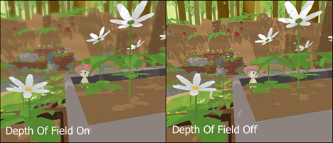
Paying attention to objects in the distance, you can see the DoF effect really adding that softer vibe to everything and also allowing the eye to focus on things easier. It also helps add a bit of mystery to objects in the distance since they are more difficult to pick out.
Though the art style appears simple, it was quite a technical challenge to achieve (and still is at the current level of development). Everything required custom shaders, and I had barely worked with shaders before starting development on this game. The water shader needed to have a specific cel-shading along the borders, the shadows had to be pixel perfect, the terrain needed a custom shader to alter the splatmaps so they’d be sharp, etc. To solve these issues I had to buckle down and read through tons of helpful shader tutorials. And when I was really stuck, I reached out to fellow developers online who would always be incredibly kind and helpful. I think if you’re someone who is just starting out on a complex subject like shaders it’s important to learn the basics and try to get a better understanding by actually making shaders on your own. Keep yourself challenged in that sense, so when you figure out the solution the knowledge really sticks with you in both memory and comprehension. But if you truly find yourself struggling with it, don’t be afraid to reach out for help!
Along with all the custom shader work, I draw all of the textures for every model by hand. Once I decided to go with slightly more details on one model, I had to do it with all of them, so this caused a domino effect of work. In the beginning of development, I spent a lot of time trying to find the right balance of detail on models that would go well with this style. I found that flat-shaded low poly models pair well with less detailed textures, but I still wanted to have some detail there.

Here’s an example of a model / texture that I tried too hard to perfect. New on the left, old on the right. I think the attention to detail is something I’ll only notice but I’m quite glad I made the changes. This was something I did with a lot of models and textures throughout the game’s development.
I’d go back and forth between Unity, Blender, and Aseprite, throwing models I’d make into the world and rapidly making small tweaks to the details. Re-importing the texture, running the game, flipping the pixilation off and on to see if it looks okay in both styles, going back to the texture and subtracting or adding detail, etc. It was a pretty tedious process and there were times when I felt like I’d never get a good balance. This is definitely the perfectionist within me taking over, and I had to get a grip on it after spending months overanalyzing the art style. I think if you’re a perfectionist like me, it’s important to take a step back and look at what you’ve done so far. Admire where you started and where you’ve ended up, and remind yourself that all of these small details will only slow you down from completing your vision. So find a balance within yourself of being satisfied with your work so you can move on and actually watch everything come together. Because the end result will be something finished, and that’s beautiful on its own.
Overall I’m quite pleased with the art direction of the game and I feel that I’ve achieved the vision I once had floating around in my head at the start of development. But I don’t think I’ll ever be 100 percent satisfied with it, and that’s just how I am, I suppose. One thing that gives me a sense of relief and confidence is when a test player will tell me how they felt cozy and uplifted when running around my little levels and that the art played a big part in this. Hearing that makes me know I’ve done something right here, and I hope others will feel the same when my game is released.
You May Also Like