Featured Blog | This community-written post highlights the best of what the game industry has to offer. Read more like it on the Game Developer Blogs.
Aqua Kitty is a retro styled pixel art shmup, where kittens mine milk from under the seabed. This post explains a little about how some of the art evolved as the game was developed towards the final version.

Aqua Kitty is an arcadey shooter originally made for PC, but ended up being released first as a launch title for Sonys PSMobile platform (Vita plus other devices), then on Xbox360 and now back on PC once again.
The game was made by a small team comprising of Dugan (Art), Gabor (Code) with music and sound effects by Electric Cafe. The box art was created by David Hankin. In the game you play a cat piloting a submarine, protecting milk mining kittens under the sea from mechanical sea creatures.
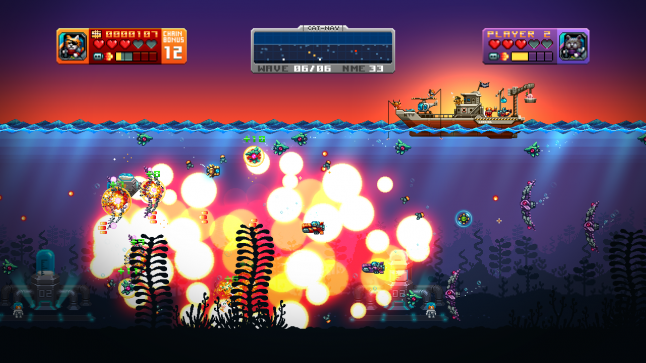
To tie in with the completion and release of the PC version I have put together this small post to help explain how some of the art was created and developed throughout the production (below is a screenshot of the finished product). We also have a Steam Greenlight page for the game.
Initial Development.
Very early on when game development began, we didn't know exactly what we were going to make but wanted to make a game which would be small, simple and could be created in our spare time.
So lots of experimentation then followed as we tried out different design prototypes.
Only basic art is needed at this stage as you risk wasting too much time creating images that may never be used in the final version of the game.
Here you can see some in this screen shot of an early experiment:
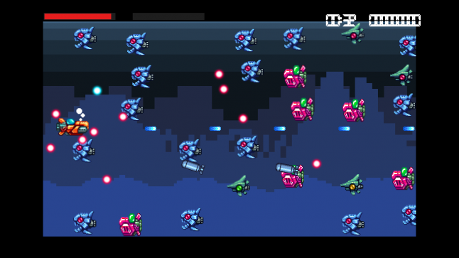
You can see an early version of the player submarine, before cats were involved – as well as very early Paleo and Pointy fish enemies. The screen was fixed scrolling right to left, and the parallax background was working at this point too.
The game changed many times through different prototypes - at one point it was a puzzley shooter, and then we had gem collecting, gem mining, ferrying...
From aiming to be a very small game, the scope grew. Once we got to a point where we were happy with some core mechanics, we could begin to focus the game and start adding new art.
Developing Aqua Kitty.
ENEMY CREATION
The first two enemies to be made were the Nautilus and Paleofish. These were designed around prehistoric sea creatures, Nautiloids and Dunkleosteus.
Using this reference they would then be redrawn as mechanical creatures with engines and propellers. A long fish body wasn't practical for the Paleofish so it ended up being mostly all head shaped.

Each enemy was given a fixed colour palette to keep it true to the old 16bit Amiga feel, but the exact number of colours and palette were not limited by old hardware. This way the art keeps a retro feel but with a richer diversity of colour (modern retro).

They all went through a few iterations too. Sometimes details that looked fine when just a still image looked confusing when the creature was zipping about ingame, so a balance had to be struck between chunky panelling and small finer details. Bold shapes and silhouettes tend to be the first thing the eye reads, then smaller details should compliment those.
The designs were also influenced by how the enemy would move or act. Paleofish slow and boxy, Pointyfish sleek and speedy, Puffafish bloated ready to pop, and so on.

Each enemy needed a distinct core colouration to make them easy to spot when the game gets busy. It's important in a fast paced shooter to be able to tell from the corner of your eye which enemy is which, as it allows you to react quickly to how they might move or fire.
R-Type is just one old game which is a very good example of this, red ships move in one particular manner, yellow ones travel in-line along a path, blue walkers stop to fire missiles etc.
EXPLOSIONS
When things explode they need to be substantial, `meaty`(not actual meat of course!) - this gives good cause and effect feedback to the player. They have destroyed an enemy, so they get clear satisfying visual reward.
Being a big fan of Metal Slug and R-Type, they acted in part as research for how to go about making pixel art explosions.
Most of the explosions in the game are made as a composite of different drawn elements – blast rings, shockwaves and both large and small drawn explosion animations.

Each of the enemies also has its own custom destruction animation, where each frame is redrawn disintegrating bit by bit. As most of the energy of the explosion happens at the beginning of the event, you’ll notice more of a punch at the start of the animation and a gradual slowing dissipation as time goes on.

The body disintegration is layered along with other explosion elements to produce the final result ingame. Randomisation of elements is a good thing to do where possible, as its very obvious if a fixed animation is played over and over again, regardless of how detailed it might be. We added a degree of randomness to the position of the child explosions that are triggered as well as the angles of the small blast waves.
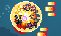
For the Puffafish and bomb explosions we used additive blend mode which wasn't something you would expect to find in the average 16bit era shmup. Additive mode when used with care can give a richer depth to the colours onscreen, as it generates a whole range of new ones depending what is underneath.

The danger with additive is that you risk overly whiting out, so I had to make sure the backgrounds all stayed within certain luminance values.
SEA WAVES
Ah the waves animations... these were quite hard to make.
One of the visual references for this game was an old IREM one called In The Hunt, a push-scrolling submarine shooter with very pretty art. That game has a variety of fantastic looking waves and some time was taken examining how they worked.
In Aqua Kitty I didn't want the sea to be too calm, but also not too rough. So no crashing waves, but still have a definite heaving motion.
I started with a sin wave to simulate a small near wave, and also blocked out a larger more sweeping wave shape.

There was no point going crazy with detail at this point, the main overall shape was most important. Next I concentrated on the larger part of the wave and elongated the canvas a little.

There were actually 12 frames at this stage. The wave was made to rise and fall but not move horizontally, we could do that ingame instead. Once happy with the overall shape, I could move onto the detailing which took quite a while to do.

The final result uses 4 layers of waves, a smaller one at the front based on the old small test sin wave, and 3 larger ones which are progressively darker the further back they go. They all move along at different rates to help give the illusion of a turbulent sea.
Gamemaker (by Yoyo games) proved helpful in prototyping elements like these waves. I could test out ideas quickly in a basic setup I created, then that could be expanded on in the actual game.
PLAYER SUBMARINE
Back in 2002 I helped worked on a GBA demo briefly in my spare time. We only got as far as making the screen scroll with some tiled artwork and having a controllable ship though.
This old ship art started as the basis for the submarine in Aqua Kitty, but had also been used in a top down format for a different game idea which had you exploring caves in the darkness, relying on sonar to navigate about.
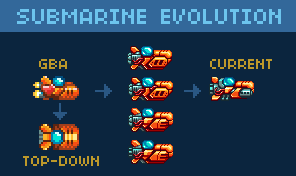
The GBA art was more a spaceship than a submarine, with rockets at the back.
From the GBA version, the resolution was increased which meant more detail could be added. A few variations were made, trying different styles of bodywork and propellers. Once we had ditched the idea of firing torpedoes the main guns then became more like machine gun barrels with cooling vents. This makes no logical sense underwater of course, but helped make the barrels stand out and also suited them recoiling backward as they fire.
After any change was made, it was left ingame for a while so it could be tested out. When making changes like these care should be taken that it doesn't seem better just because it is new, a lot of time can be wasted doing small tweaks if you are not careful. So it can be better to do a number of changes in one pass, then leave alone for while, then review.
Later once the cat pilot was added we then moved on to adding up and down tilt animations. Without these the craft looked really stiff, but with them it feels much more dynamic. We also tied the propeller speed to the sub speed, so you can see ingame that the faster you move the faster it spins.
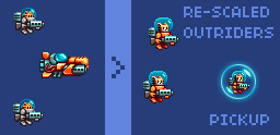
One of the the player pickups, the support gunners, began with very small heads. It was another one of those things that seemed fine as a still image, but ingame was really hard to make out. So their heads were increased and suits made orange to match the player sub.
The orange suits proved to be a bad idea, as it confused the difference between them and the player when the enemy bullets were flying – so they were switched back to greyish outfits once again in the final version.
LOGO ITERATION
Making Logos can be tricky. Sometimes they can come together quickly - like the one made for a game called Gravity Crash (for JAW Ltd) which was done in just a few days, but others can take some time to develop. Aqua Kitty was one of those that took time to complete...
For a while I was determined to make a pseudo 3D slanted logo work.

But after numerous tweaks I still wasn't happy and so went back to the drawing board to try to begin afresh. This meant trying lots of different shapes and styles:
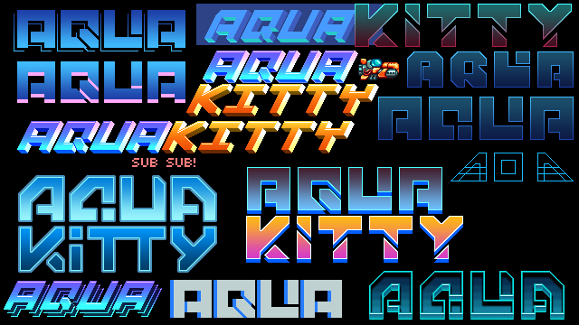
Key considerations for the logo were for it to look retro, read easily from a distance (important to help people find the game when browsing) and be scalable. Scalability is useful later down the line when you might need to make banner art for a webstore or tiny icons for a console menu screen.
The final version was made on a 8x8 pixel grid, with the main thicker lines being 12 pixels wide (1.5 grid squares wide). Sticking to the grid was useful as it created rules for how the letters should be built, as you have to come up with solutions that fit those rules.

And the final version also had the main cat pilot added to it as well as the tagline below it.

BACKGROUNDS AND SUNBEAMS
The backgrounds of the game are made of several tiled layers that move at different speeds when you scroll along. The initial idea was for them to pixelate the further away they were, like a retro style of depth of field.
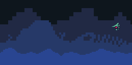
Pretty chunky looking I think you will agree – the style didn't match well with the sharply detailed player and enemy sprites. So as the game developed, so did the backgrounds and a number of designs were tried out.
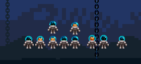
Brightness order was switched around a few times – logically it would seem to make sense to have the lighter layers nearest but that meant backgrounds would always be near black which wasn't very exciting.
Also in this picture above you can see tests for the miner kittens, trying out different head sizes and positions as well as different helmet styles. At one point they had pneumatic drills and were digging up gems from the seabed to collect – but that was another gameplay experiment that didn't work out so well.
I also tried adding gradients at one stage to make the levels feel more hazy. At first the change looked great, but then after playtesting them for a few days they just didn't feel quite right so the flat shaded style came back instead.
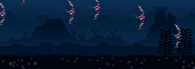
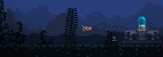

Different types of detail was added to the seabed too, but it was always found to be too distracting when playing, so it got the chop (as did the ghost jellyfish).
The sunbeam effects began as very pixelly art too, but like the backgrounds they proved to be too chunky and were reworked.

Gamemaker was again used initially as a testbed to try out the beams. I could spawn, fade and scale them with a very simple script. Once I had a good result working, those timings could be taken over to the game and coded in properly.

(A single beam image. Being additive it has no alpha edges and is instead surrounded by black which is of course 0,0,0 RGB and as such adds nothing)
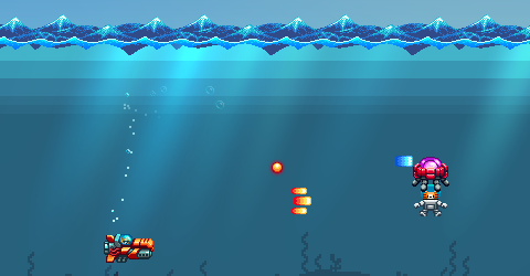
The beams have some randomness to their initial size and transparency - fade in and scale up until scaling back down and fading out – each with variable timings. They are set with additive blend mode so they brighten up whatever they sit above. Only two different coloured beams were needed in the end per area theme.
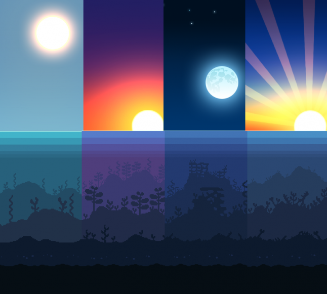
Below is a mockup towards the end of development of how the different themed areas would look. It was further worked up into what can be seen in the final game.
BOX AND POSTER ARTWORK
When Aqua Kitty was ported back to Xbox360, we needed a new box art graphic for use on the 360 store. I started things off by researching some old Japanese PC Engine and Amiga box covers I remembered liking to help choose a style:
 (All images © their respective owners)
With an idea in mind I then made a very rough sketch:
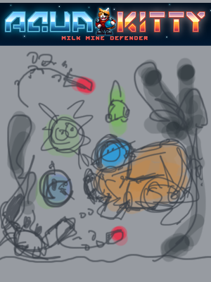
Amazing yes? (not really) - action packed with a crab at the bottom left firing at the player, two torpedoes closing in, enemy fish chasing behind and big swirly plants framing the scene.
I didn't have time to develop the poster so deferred instead to a very experienced games artist called David Hankin who would be able to do a much better job. When he got involved I passed over the sketches and reference to him so he could further work up and improve the cover art.
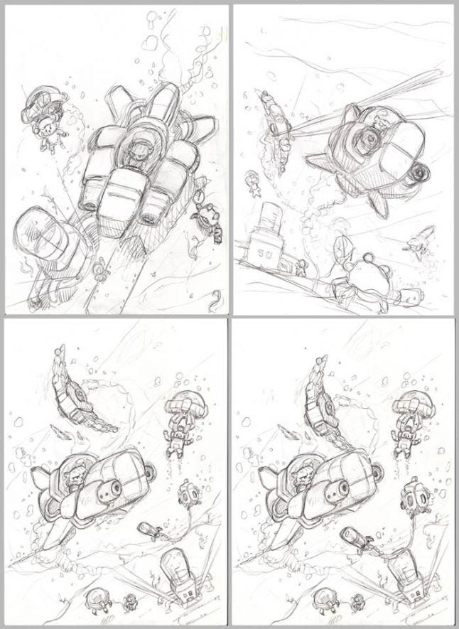
David then tried out a number of layouts in pencil first of all. Once a design was selected all the different elements were painted in on separate layers where possible. Using layers gives flexibility to adjust the layout easily at any time.
Once a version was ready, we could review it and make tweaks if needed then review again until everything looked just right.
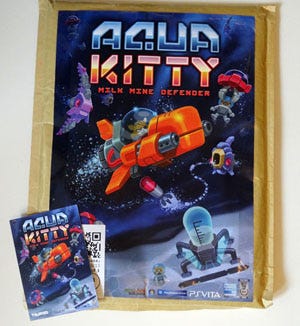
We later made a CMYK version to be used to print posters and postcards, and found switching to CMYK altered the game logo quite a bit (due to CMYK having less colours available than RGB) – so it needed some rebalancing to make it look less dulled.
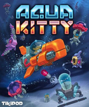
For the Xbox360 console the full “Aqua Kitty - Milk Mine Defender” title was actually too long so we had to chop it off to be just “Aqua Kitty” to get it accepted. Below is the CMYK poster and postcard once printed, note how the turquoise in AQUA is dulled:
DELETED ITEMS AND OBJECTS
Finally, here is a collection of some of the art that never made it into the finished game.
Jellyfish test designs and colours. The final red version worked best in the end as its a key enemy so should stand out the most:

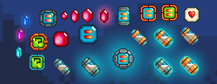
Various pickups – gems and milk capsules:
Original modified sub turn animation (zoomed in). Made for testing purposes before the proper art was made for the submarine:

Many types of goldfish designs. I still like the orange and grey ones quite a bit and will try to work them into another game someday. The triple eyed ones are quite silly too, maybe we should make an Aqua Kitty rpg whereyou can get to explore and talk to all these creatures:

Here we have an alternate pump type. Also old test tankers piloted by kittens that would dock into milkstations. A squid enemy and an elite styled black Pointyfish. Not sure what the Police submarine was for, maybe a `hurry up` style enemy that would appear if you took too long. There is also a drilling kitten, harvesting gems from the seabed:

Well this is the end of my post, I hope you found it an interesting read.
The PC version of the game is due out on the 28th October 2013 on GOG and Desura. We also have the game submitted to Steam Greenlight, so if you like the idea of saving kittens and pumping milk from your Steam account head over and VOTE YES at:
http://steamcommunity.com/sharedfiles/filedetails/?id=93326437
If you would like to see more info on the game head over to its webpage at:
http://tikipod.com/aquakitty/
- where you can find links to the game soundtrack as well as all the reviews and awards that Aqua Kitty has aquired.
THE END!
Read more about:
Featured BlogsAbout the Author(s)
You May Also Like
